WorkNumber 03Walmart
Designing how people shop in VR, before there were standards
At Walmart's innovation incubator I designed and tested the building blocks of a virtual store: how you inspect a sofa, compare it, save it, and design a room around it.
- Role
- UX designer for VR, desktop and mobile
- Where
- Walmart Labs, Store No. 8 incubator
- Team
- Two UX designers, a product owner, three engineers, operations and the CPO
- Years
- 2019 to 2021
The problem
VR had no conventions for selling physical products. There were no recognizable components to borrow, no metrics for what good looked like, and no benchmark data to compare against.
Without standards, everything is harder to learn. The only way forward was to treat each interaction as a hypothesis: design it, prototype it, put a headset on someone, and measure what happened.
What I did
I helped concept, prototype and test a set of product interactions that the studio's development teams could reuse. I led the design of the Design Room, a feature that lets shoppers build their own space. And I managed the design system for the web portal that brands used to get their products into VR.
- product interactions met their completion and error targets
- 5 of 5
- scenario completion across those five
- 99–100%
- critical errors recorded
- 0
Who we were building for
Foundational research came first: who shops for home decor at Walmart, and what they would need from a virtual version of the store. The answer pointed at in-store shoppers, and at women in particular, who were the sole decision-makers on these purchases 53% of the time and part of a joint decision another 27%.
- of Americans aged 18 to 29 shopped for home accessories in person at Walmart in 2018
- 51%
- of those aged 30 to 49
- 59%
- of those aged 50 to 64
- 56%
The persona we designed for was a millennial mom, in the store, probably with her kids, short on time and on budget, inclined to buy and leave. We kept two shoppers in mind behind her: the in-store shopper, who picks a product and asks the department manager what goes with it, and redecorates every season; and the online shopper, planning a bigger redesign from inspiration gathered elsewhere, who shops both ways.
- “I would like to explore more decor than what is in the physical store.”
- “Walmart sells farmhouse and boho decor!? That’s amazing.”
- “I’m not sure if I would trust buying expensive products in VR.”
Those three quotes set the brief: a trusted, curated custom-room experience for the in-store and at-home shopper, with menus any kind of user could find, an onboarding tutorial that teaches without boring, and enough confidence built up along the way to convert.
Three curated showrooms, the starting point before the Design Room let people build their own.
Deciding what to measure
Before testing anything we needed a definition of success. After reviewing models of technology adoption, we settled on three things a VR shopping interaction had to be. Our hypothesis was that if it was intuitive, comfortable and immersive, it would work.
- Ease of use
- System Usability Scale, Single Ease Question, and the After-Scenario Questionnaire.
- Comfort
- Simulator Sickness Questionnaire, read across nausea, oculomotor strain and disorientation.
- Sense of presence
- The Slater-Usoh-Steed and Witmer & Singer presence questionnaires.
Every prototype went to at least five participants, who tried every scenario. Sessions ran remotely on Oculus headsets with a facilitator and a note-taker. Each scenario was scored 0 for failure, 1 for completed with help, and 2 for direct success, and we logged critical errors and time on task.
Five ways to evaluate a product
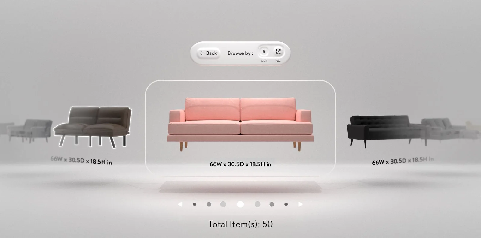
The goal was to give shoppers instant access to the information that helps them decide. We kept what works in e-commerce and added what only VR can do, such as showing a sofa's dimensions in the space around it.
| Interaction | Completion | Critical errors | ASQ ease | ASQ time | ASQ support | ASQ total |
|---|---|---|---|---|---|---|
| 3D Explore | 100% | 0 | 6.33 | 6.83 | 6.50 | 6.55 |
| Inspect | 99.16% | 0 | 6.66 | 6.83 | 6.16 | 6.55 |
| Sort | 100% | 0 | 6.33 | 5.85 | 6.36 | 6.18 |
| Rotation | 100% | 0 | 5.61 | 6.23 | 6.16 | 6.00 |
| Compare | 100% | 0 | 6.24 | 6.11 | 6.12 | 6.15 |
All five cleared the bar for completion, errors and satisfaction. One did not clear everything: 3D Explore missed its 35-second time target while the other four met theirs. People were completing it and rating it highly, but taking their time, which for an explore feature is a result worth thinking about before calling it a failure.
Teaching without interrupting
Onboarding explains the headset and controller before the experience starts, and tooltips appear the first time someone enters a room, pointing at what is nearby and how to use it.
Sessions lasted fifteen minutes, so a prompt appears at minute twelve. That leaves enough time to save a wishlist or check out without the session ending mid-thought.
A room for the things you might buy
Shoppers needed to see everything they had saved before committing. The wishlist is its own room: a curved shelf that grows and shrinks with the number of items. From there you can open an item's details, remove it, or finish. It is a checkout flow rebuilt as a place.
The Design Room
Until this feature, VR shopping happened in curated showrooms. You could swap a sofa for another sofa, but you couldn't move it. User testing told us what that cost: people wanted to arrange a space that felt like their own home before they felt confident buying for it.
I led the design of the Design Room, from the first concept through architecture, prototyping and usability testing. When a shopper enters, a circular tray loads in front of them with three tools as 3D objects: build walls, add furniture, and paint or wallpaper.
Decision
Teach each tool three ways at once
Each onboarding step is delivered as animation, voice-over and written text together. The repetition reinforced each step, and it meant the tutorial did not depend on any one sense or reading speed.
Decision
Explore the tray's behavior before building it
How the tray rotates, how it paginates, and what hover and select look like on a wall were each drawn out as options. The most viable went to prototype and test.
The usability test was exploratory: participants wandered the room freely first, then worked through set tasks, talking aloud as they went, with a facilitator, video and screen recording, and a note-taker. Afterwards each rated the whole experience on the Single Ease Question, from 1 for extremely difficult to 7 for extremely easy.
Design Room sessions in the test room, with the headset view mirrored on screen for the note-taker.
- task completion in usability testing
- 73%
- ease of use, Single Ease Question
- 4.66 / 7
- effectiveness
- 4 / 7
That completion rate is well below the product interactions', and the sessions explained why. People understood what the tools did but struggled with the tray's height and placement, and didn't realize they could move it. The next step was a visible handle on the tray. I'd rather show this result than hide it: the testing did its job, which was to find the problem while it was cheap to fix.
The other side: getting products into VR
A virtual store needs a catalog. A web portal lets brands upload products by spreadsheet, map their columns to the catalog's, and review each 3D model before it goes live. I managed the portal's design system, including its look and feel, and used it to design the product catalog.
What I took from it
- When there are no conventions, a measurement framework is the first design deliverable. It turned opinions about VR into results we could compare.
- Borrow the familiar where it holds. Cards, carousels and a wishlist carried over from the web; scale, rotation and rooms were where VR earned its place.
- Report the weak result. The Design Room's 73% taught us more than the interactions' 100%.